Recently there’s been a bit of a furore around a post written after we at GoCardless launched our redesigned homepages. I wanted to make a few points – to be clear these are my thoughts, and they’re not necessarily shared by my colleagues.
Responsive Web Design is not always appropriate
Elliot Jay Stocks says “the war has not yet been won
”. I think that’s a rather black and white way to look at a much more nuanced issue and that painting it as a war is not especially helpful. As with everything on the web there’s degrees of appropriateness.
In a lot of cases, a well thought out responsive site is awesome. A great example would be a blog (go on, resize the window on this page). In other cases though it’s totally ill-suited.
Take the example of the GoCardless homepage. There’s a fair amount of information here and not everyone wants to see all of it. By setting a small screen’s zoom level to 100% and inlining all of the content we’re forcing the user to scroll (and scroll and scroll) through potentially useless information. In my opinion it’s much better to provide a high level overview and let the user zoom into the interesting sections.
I appreciate that Elliot is arguing that it’s not all about mobile but honestly which device are you using that has a very narrow screen but can’t zoom and pan?
Let’s look at GoCardless on an iPhone as an example:
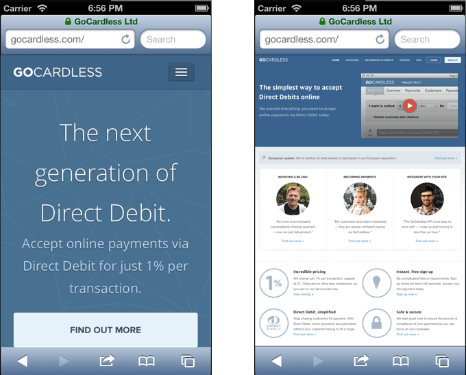
Which is a better experience? Which gives the user a quicker understanding of what’s happening?
I think online maps are a good analogy. You wouldn’t open Google Maps, zoom in as far as possible and then start panning around to find the area you want to look at. Instead you look at the overview, pan around until you’re in broadly the right place and then start to focus in.
In many cases, especially marketing and homepages, this is how I would like to use websites on a mobile device and I bet I’m not alone.
Obviously it’s not all bad
That said, there’s clearly a place for responsive design. I’m not saying that it’s a fad and should be ignored. Blogs look great as a phone-width column of text, I wouldn’t want to be zooming and panning around GMail on my phone and that’s just two examples off the top of my head.
All I’m saying is that as with everything there’s a time and a place and that I often find myself wishing I could see the full site rather than the scaled down responsive version I’m presented with. Let’s not go off the deep end with talk of wars and treat this as the nuanced issue that it is.