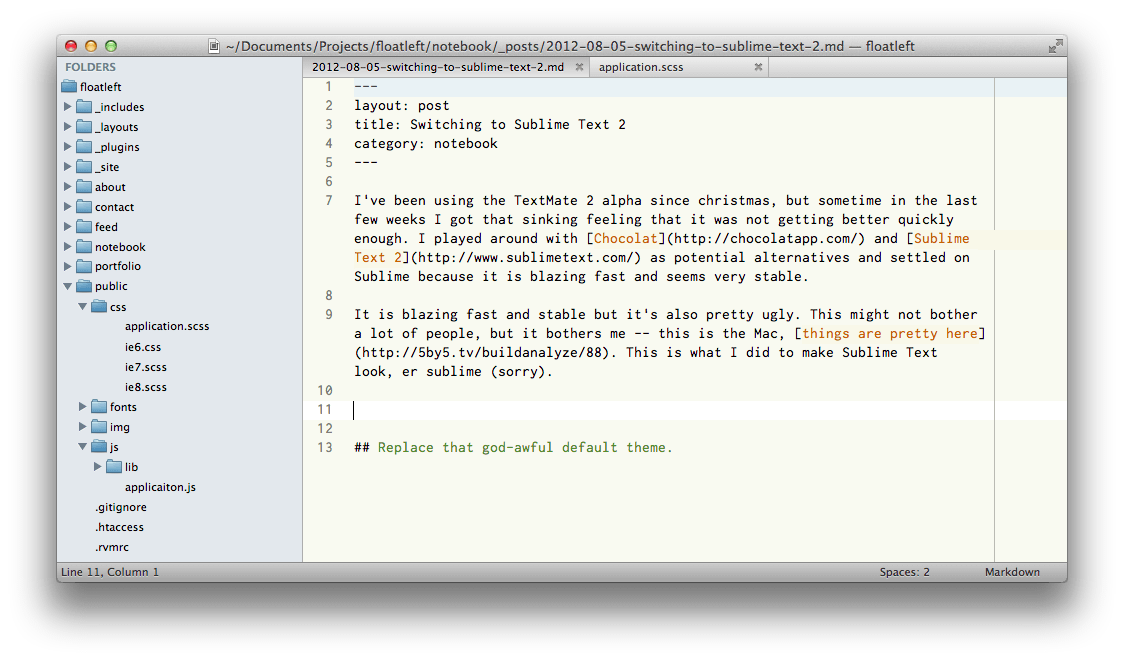
I’ve been using the TextMate 2 alpha since christmas, but sometime in the last few weeks I got that sinking feeling that it was not getting better quickly enough and probably never would. I played around with Chocolat and Sublime Text 2 as potential alternatives and settled on Sublime because it is blazing fast and seems very stable.
It is blazing fast and stable but it’s also pretty ugly. This might not bother a lot of people, but it bothers me – this is the Mac, things are pretty here. This is what I did to make Sublime Text look, er sublime (sorry).
Replace that god-awful default theme

Aqua is a great looking theme which brings a much more mac-like feel to Sublime. I took this theme and tweaked it slightly to show file icons in the sidebar. My variation on the theme is available on GitHub or you can add the repo to package control: git@github.com:mrappleton/aqua-theme.git.
A nicer icon
![]()
I quite liked the default icon but found it really difficult to pick out when I was switching between apps with cmd-tab. I found this icon by Dmitry Svetlichny on Dribbble via a tweet from Chris Rowe. It’s easier to spot and I think much prettier too.
Syntax Highlighting
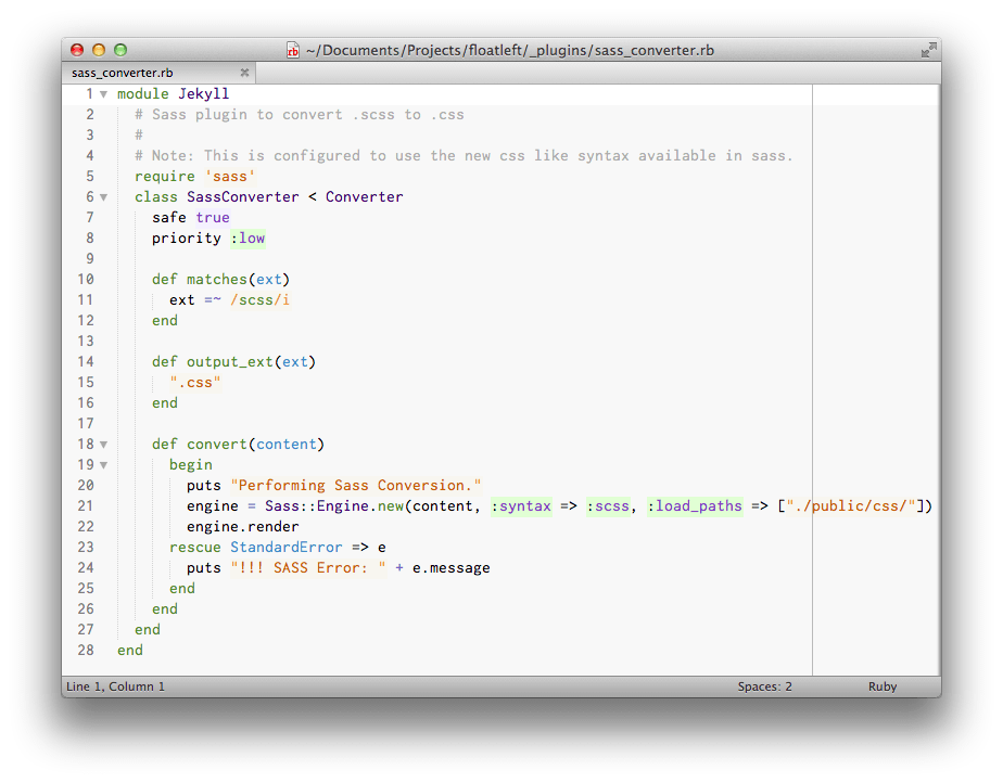
I was having trouble getting used to Sublime and I figured that it was down to things being similar but not identical to my previous editor. I switched from Railscasts to a new theme as a kind of constant reminder that I was using something different and not to expect it to be exactly like TextMate.
I love the dark on light Espresso theme included in Aqua which I have been using with a single tweak to make the background a very light grey and the line highlight white.

This tweaked version is included in my fork of Aqua.
Overall I’m really pleased that Sublime is flexible enough to allow this kind of customisation but it would be nice if the developers could spend some time on making it a more native Mac experience. In the mean time I’m really happy with my current setup.