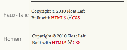
Dan Cederholm's best available ampersand technique is by now prety well known and is in use all over the place -- including in the footer of this very site.
But when I was implementing it, I wanted to make a small change to the font stack. So this:
span.amp {
  font-family:Baskerville,'Goudy Old Style',Palatino,'Book Antiqua',serif;
  font-style:italic;
}
Became this:
span.amp {
  font-family:Baskerville,GoudyBookletter1911,'Goudy Old Style',Palatino,'Book Antiqua',serif;
  font-style:italic;
}My plan was to include the ampersand from the free font Goudy Bookletter 1911 (by the League of Movable Type) as the first fallback for those without Baskerville installed. This font could be served using the CSS3 @font-face rule to allow pretty much all users to see my second choice ampersand. I also created a custom subset of the font containing just the ampersand, to reduce bandwidth requirements and load time.
This all worked nicely except for the fact that I was specifying the italic version be used for each, and the Goudy Bookletter 1911 ampersand belongs to the Roman letterset. This forces the browser to render the Roman glyph as an ugly slanted faux-italc.
This may not seem like too much of an issue, but if the whole point of the exercise is to present the very best ampersand available then it kind of defeats the object to serve up a distorted version.
So how can we fix this? There is no way in CSS to specify italics for one font in a font stack and roman for another, so we need something a little bit more clever...
The Solution
My solution to this little puzzler relies on JavaScript, and works like this:
- Detect whether the user has Baskerville installed.
- Assign a class to the
<body>element (either.baskervilleor.no-baskerville. - Detect whether the user has a
@font-facecompatible browser. - Assign a class to the
<body>element (either.fontfaceor.no-fontface. - Define different CSS properties depending on which classes are set on the
<body>element. To detect whether Baskerville is installed, I am using a jQuery script from Remy Sharp.
What makes this important is that: Comic Sans, in all it's glory, is actually unique.
From there it's a simple case of comparing the font in question against Comic Sans and if they match, it's not installed.
Implementation is as simple as including Remy's script in the page, and running the following jQuery function:
$(function() {
  font.setup();
  $('html').addClass(font.isInstalled('Baskerville') ? 'baskerville' : 'no-baskerville');
});
Now we have a class assigned to the
<body>element telling us if we have Baskerville installed, we can move on to@font-facedetection.For me, this was even easier as I was already using Modernizr to allow HTML5 elements. By including the
modernizr.jsscript on a page, you automatically get a number of classes assigned to the<body>element telling you which CSS3 features are supported by the user's browser -- including.fontfaceor.no-fontface.All that remains then is to craft a bit of CSS to properly take advantage of these new classes:
span.amp { /*To take care of those with JavaScript disabled*/
	font-family: Baskerville,GoudyBookletter1911Regular,'Goudy Old Style',Palatino,'Book Antiqua',serif;
	font-style: italic;
}

.baskerville span.amp { /*For those with Baskerville installed*/
	font-family: Baskerville;
	font-style: italic;
}

.no-baskerville.fontface span.amp { /*For those without Baskerville but with @font-face support*/
	font-family: GoudyBookletter1911Regular;
	font-style: normal;
}

.no-baskerville.no-fontface span.amp { /*For those without Baskeriville or @font-face support*/
	font-family: 'Goudy Old Style',Palatino,'Book Antiqua',serif;
	font-style:italic;
}
Implementation
Summary
You may feel that this is all a bit much just to avoid a slopey ampersand, and you might be right. But isn't it the small details which separate good design and great design? I know I love to see sites where the author has clearly sweated every single detail, and I want others to see that in my work too.

